Reporting Framework
Role: Product Designer (sole designer on project)
Duration: 6 months + ongoing
Team: UX writer, UX researcher, PM, Front-end developers
Defining the Problem
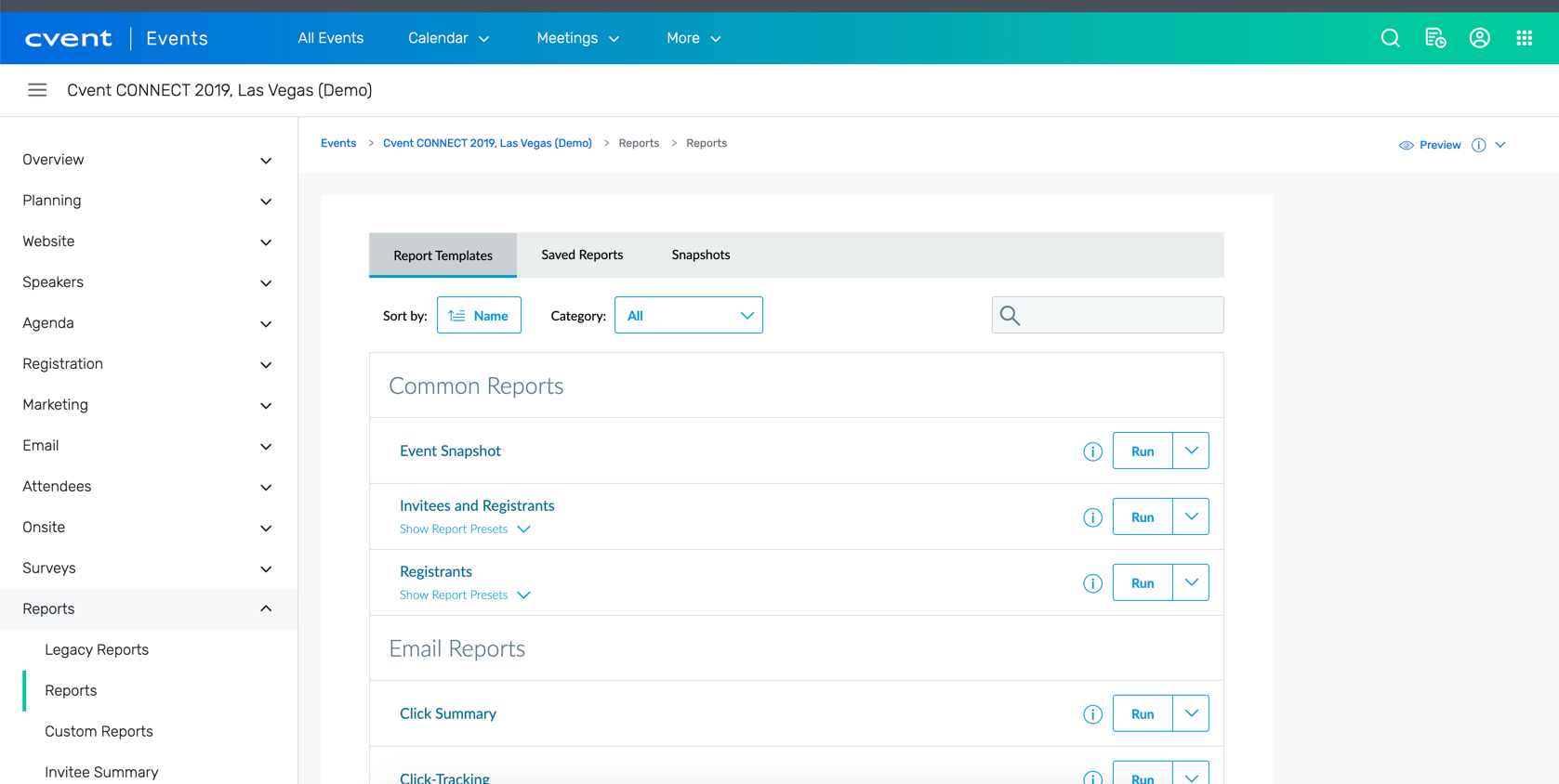
We want the reporting framework to meet competitive standards of providing an intuitive and effective reporting experience. The current reporting experience feels sluggish, confusing and lacking world standards.
How might we improve it that the reporting framework is more intuitive and easier to use as well as a class leading experience?
Current Features


Competitive Analysis and research
I took a look at what Cvent’s competitors offer in terms of reporting and what business intelligence tools in the market currently offer that would work for Cvent. This resulted in hundreds of screen shots and screen recordings of competitors. Below you can see the feature inventory of the competitors, both direct and indirect. I wanted to figure out what features are necessary to enhance our reporting system without trying to become a business intelligence tool.
Workflow
One of the first things I did before even starting on any designs was that I went back through the current workflow users go through to see what works and validating the current personas being used for this workflow. This also included running a baseline research study test with the current reporting framework to get exact feedback from users on what they think needs improving, what they like, and what they would like to see in the future. This also allowed us to get a baseline SUS score to compare any new designs as well.
Personas
Primary Persona
As an event specialist, I want to quickly setup simple reports for my team so that they don't have to spend time doing it.
Primary Persona
As an event planner, I want reports that have all fields I need and are clearly labelled so I know what data is being pulled with that report.
Secondary Persona
Use case 1
As an event director, I want to customize my reports to add or remove content so I can easily monitor my business objectives.
Use case 2
As an event director, I want to allow user and permission based access to reports and its content so that I can manage my team effectively.
Initial Wireframes
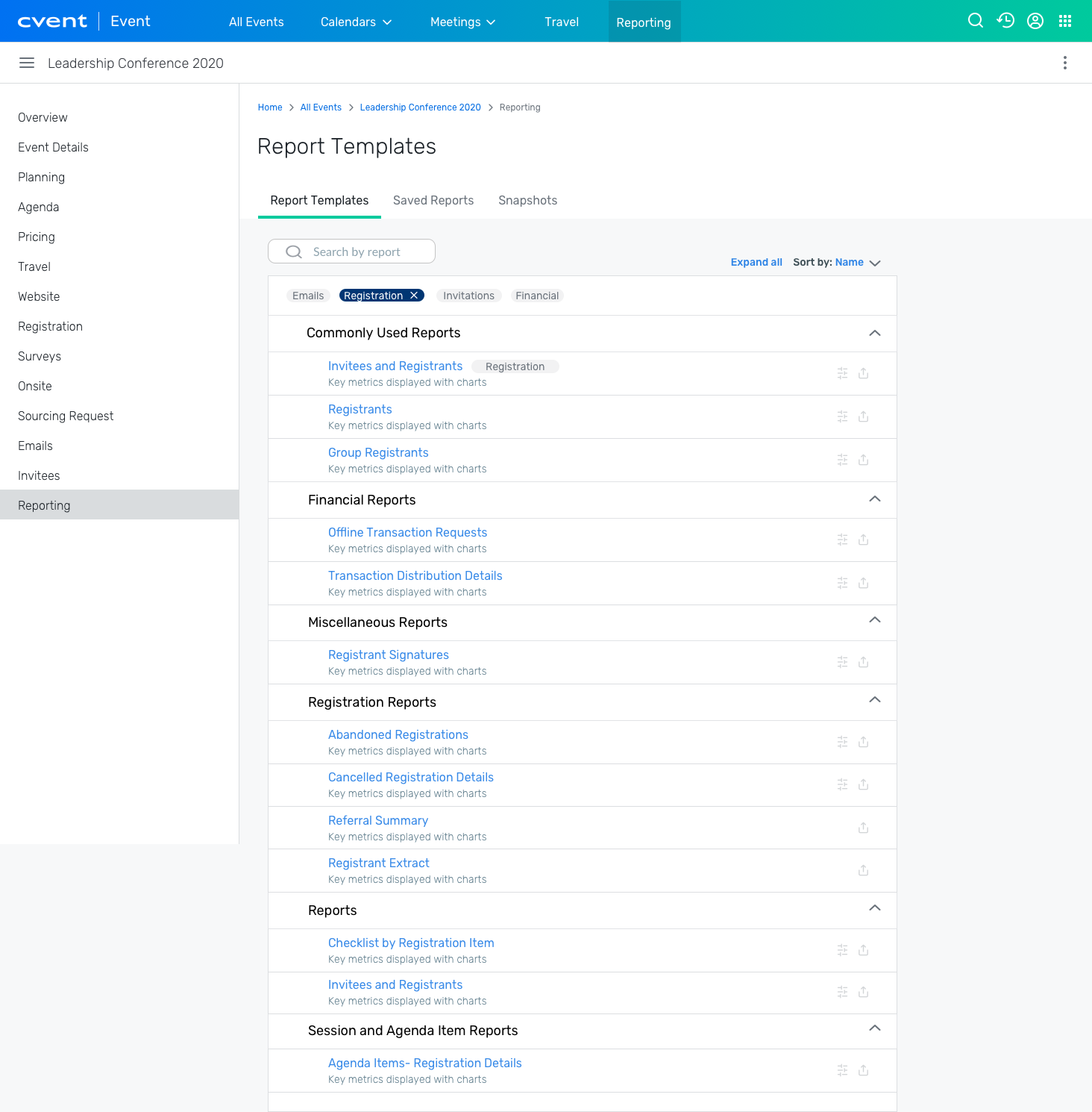
Taking prior client feedback and factoring in the initial research I did, I started to sketch multiple iterations to find an initial design that our team agreed on. After multiple design critiques and UX/PM meetings, I was able to consolidate the ideas and comments to start creating wireframes on Sketch.
During this process, I had to take a new approach by using our new design system components. I was able to create new iterations using the new design system components and layouts to create new designs.
User Research Study #1
The first test conducted was to figure out the general thoughts and behaviors of all users (new to reporting and experienced users). We gathered a group of 50 users to do click-tests on the current list page and the initial wireframe redesign. This proved to show us some key insights: users are having difficulty finding new reports on the list view, no way of marking frequently used reports, and users had no idea what data each report included.
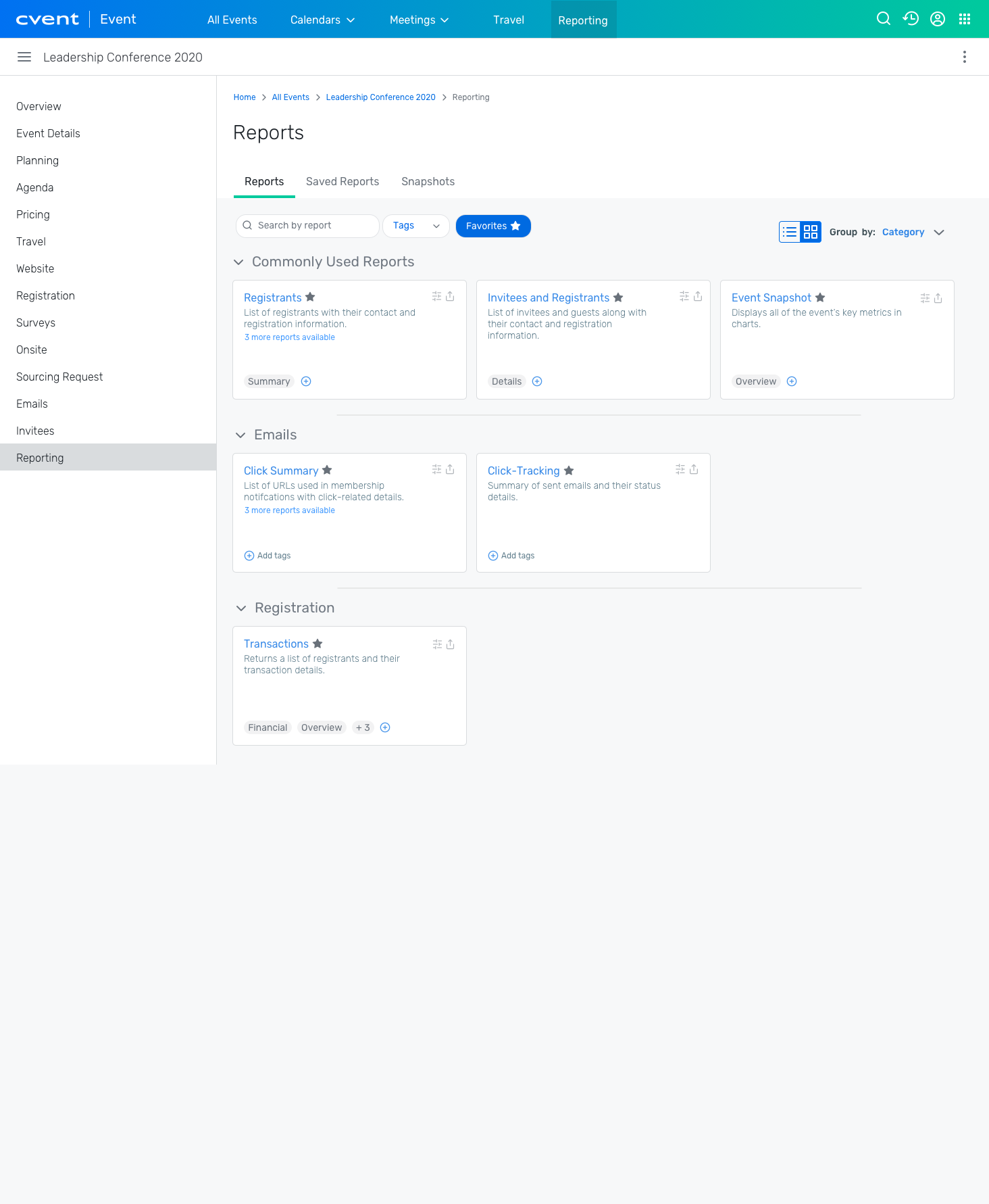
I was able to take these research insights and make useful iterations. This led me to re-think the entire way the reports were displayed. There were tons of iterations that I went through with the team, which ended up with us creating a grid view utilizing cards. The main design solutions I knew I wanted to implement were to display descriptions of reports without the user having to click on anything else, a way to favorite reports, and a way to filter the list of reports.
Refined Prototype
Grid view
List view
New Features
During the process of trying to solve the problem of discoverability, new features were explored and tested throughout. Each of these features went through their own research study.
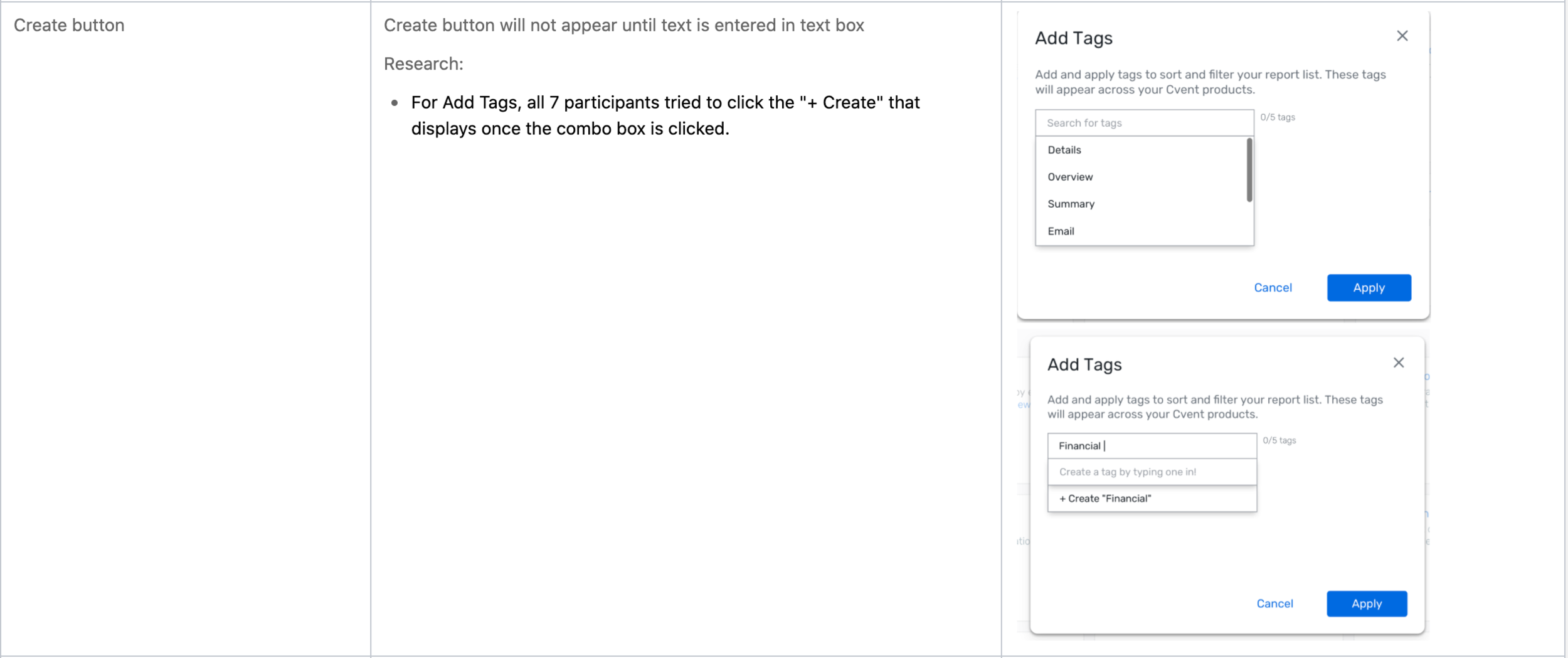
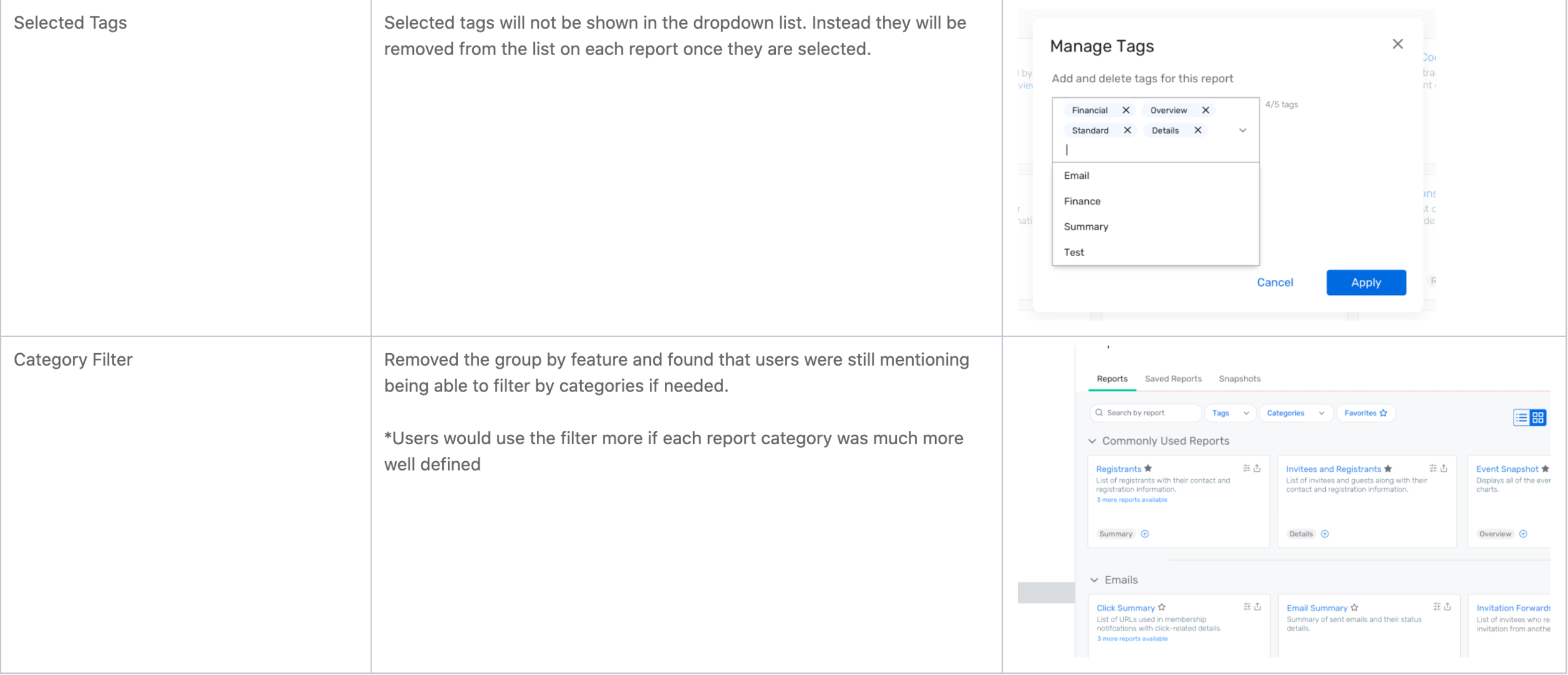
Combo box to be used as a tag management system
Favorites as a filter
Filter by tags (account level)
Research Study #2
With the refined designs, we went back to test this prototype in moderated studies. This involved gathering 7 users (new users to our enterprise clients). The studies showed big improvements in report discoverability and the general usability of the reporting framework as a whole.
Updates
Main Takeaways
Favoriting. "On a scale of 1 (Not at all useful) to 5 (Extremely useful), the average rating for Favoriting was 4.4."
Icons were recognizable and interpreted correctly
Cards and grid layout was accepted well
Testers appreciated having a list view as well
Saving tags at account-level (preferred, but participants couldn't tell from the interface that tags are saved at the account level)
Possible Additions
A category of "commonly used reports" that actually updates as the user utilizes various reports
Current "commonly used reports" contain the most used reports shown in our tableau results
Recommended reports section - utilizing machine learning
Report templates that can take the place of a lot of reports once customizable widgets are implemented so that the user can start with a default template but customize to their liking
Possible subtractions
Unused reports (specifically in Events)
Overlapping reports

