Case Study
A topic rarely discussed — Where should I go get my hair cut? A potentially stressful decision for many folks. People search through Yelp, Google Reviews, and multiple friends before eventually giving up and going to the closest salon/barbershop you see.
Context
I grew up in a household where both my parents are hair stylists and I grew up in their hair salon. I have watched and heard the struggles of customers trying to find a good and reliable hair salon. I’ve never had to pay for a haircut my entire life until 2016! But the first time I tried looking for a place to get my hair cut, it seemed nearly impossible. I would do my due diligence on Yelp, Google, social media, and asking friends to find a reliable shop.
This was the beginning of Ploom, a search database that will help users find a hair salon or barbershop where they can comfortably go-to regularly. This is achieved through an app that allows users to search and ultimately set an appointment at a store of their choosing. Ultimately, creating an app that allows users to venture out to new salons and barbershops that they would have never gone to or known about without having pertinent information of these shops, photos, and other user’s experiences.
Users need a way to do customized research in one spot because it is difficult to trust people with their hair without more insight and knowledge instead of having to search through multiples apps and websites such as Yelp, Google Review, and word of mouth to piece bits of information together.
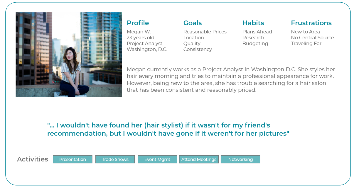
“... I wouldn’t have found her (hair stylist) if it wasn’t for my friend, but I wouldn’t have gone to her if it wasn’t for the photos.”
Discovery
I interviewed 10 people who live in different parts of the Washington, D.C. metro area. I wanted to dive into the issues that people face regularly when searching for a place to get their hair done. I wanted to see the differences between someone who lives primarily in the city versus in the suburbs as well as difference based on access to a car versus public transportation.
After the interviews, I was able to start creating my primary persona. Then I took the preferences and thoughts of the interviewees to create an affinity map to find themes in their responses. This also allowed me to create a feature prioritization matrix to figure out what features need to prioritized in an unbiased manner.


Competitive analysis
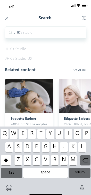
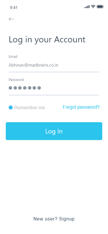
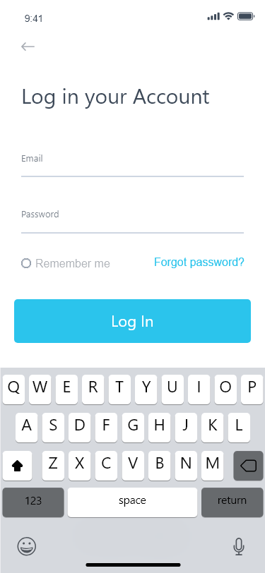
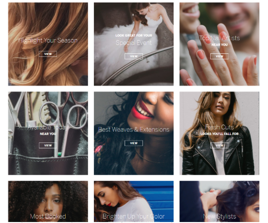
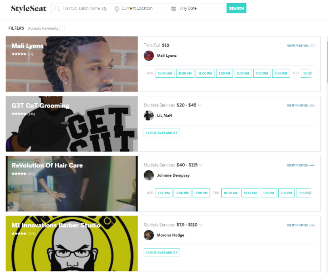
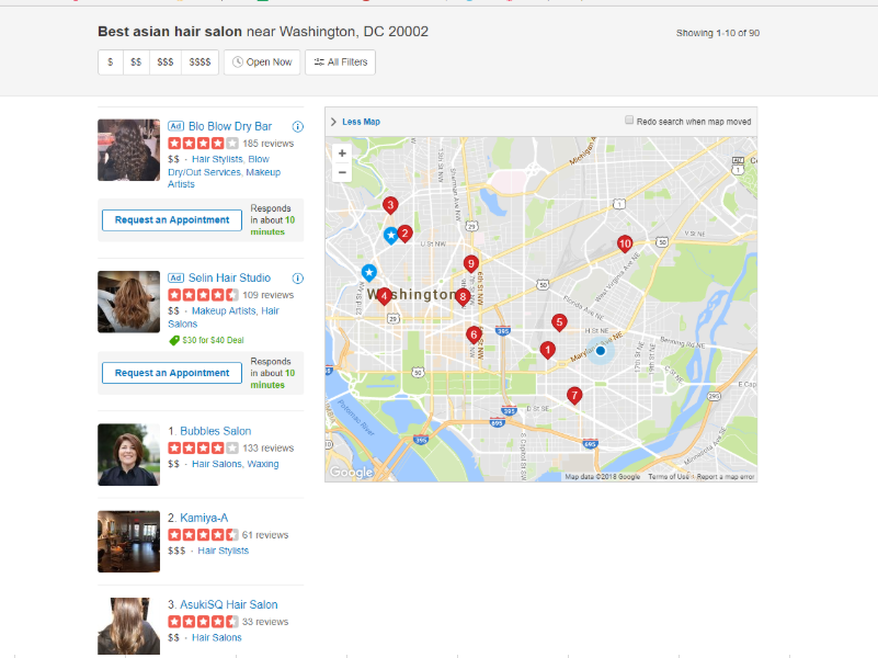
Initial discoveries I made from my feature inventory is that the more features an app or website has does not necessarily mean that it is more useful than another with less features. I've found that the certain design features that seem particularly important are intuitive interface (ex 1) along with ease of making appointments (ex 3), photos of services, and being able to easily filter through services (ex 2).
Insights
One thing I found lacking across the board was information about a shop’s experience with various ethnic hair - a very real issue/concern that is rarely addressed when it comes to hair salons. Yelp came closest with being about to look up different shops based on adding "Asian," "Black," etc. but it only brings up the ethnicity of the business owner and not its experience. The bigger database competitors like Yelp and Google Review tend to be a lot more broad. However, after interviews and high-level research, customers want to be able to find details and specifics that are relevant to hair salons and barbershops (i.e ethnic hair, services provided, length of service, languages spoken, appointment availability, etc.) without having to go through each shop’s website. The sites and apps that look simpler are much more appealing and inviting to use. The ideal website and app should hold a lot of relevant features listed above, but in a way that it isn’t cluttering the user's experience and flow.

User Research Testing
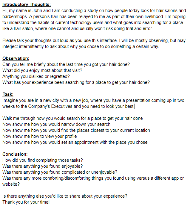
After initial interviews and further research, I was able to establish a foundation to build on. I was able to establish a diverse set of personas to cover a wide range of circumstances. I then went to work designing a sitemap and establishing a screen flow while identifying what the key screen would be. I was able to create paper prototypes to continue tests and drill down into the user’s needs. I wanted to keep the screens very familiar by including a lot of affordances on each screen, as well as keeping the flow of the app similar to apps used regularly like Yelp.
Research Highlights
Observations:
Folks were accustomed to apps that felt similar to Yelp, Google Search, Open Table, Zocdoc, etc. However, when my interviewees were searching specifically for hair salons and barbershops, they felt more comfortable selecting a shop because they had more pertinent information readily available to them. After seeing that they had a quick overview of each shop available, they still wanted to be able to compare reviews, see photos, and post their own reviews and ratings. An important fact to note was that users did not completely believe reviews, but instead take bits of information from various reviews to formulate their own conclusions.
“Location matters the most to me, but if I was able to find a consistent barber, I’d be willing to travel”
Insights:
Users wanted to have a map to visually see where the shops were located. Also, users found it immensely helpful to be able to see photos first and foremost of a particular services/end product. This would allow them to visually confirm that the particular barbershop or hair salon could indeed do the style or color they were searching for.
Design Recommendations
Make each screen distinguishable
Don’t overcrowd a screen with too much information
Future Research and Additions
A feed with new styles and trends
Q&A page
Filtering stores by available appointment times
Maps that contain beauty supply stores around hair salons and barbershops


