Virtual Conference Chat
Role: Product Designer (sole designer on project)
Duration: 2 weeks
Team: UX, PM, Front-end developers
What is the chat for?
Virtual conference chat (events that can get up to 500+ users at a time)
Virtual exhibitor booth chat (Links, documents, images)
Virtual events and sessions (Polls, Q&A)
Defining the Problem
The current chat system is very basic and does not allow for much control, customization, or recognition.
How might we update the chat system within the given limitations to allow chat to be useful and productive in virtual conferences?
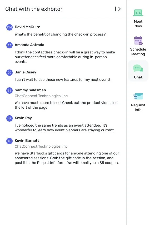
Current Design
Company name
To differentiate moderators and attendees, currently the Company’s name is shown below the moderators
Exploration
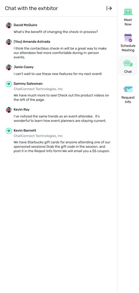
Something familiar: Checkmark, verification
Something that stands out: Icon favicon or company logo favicon
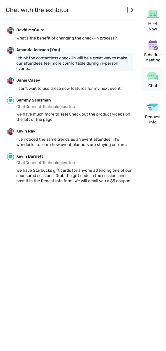
Differentiating the user
You - text next to name
Colored background on message
Different Icons
Badge Icon to resemble a conference badge
Tags - “Staff”
Label - “Staff”
The first solution that was well liked was the “Staff” label. It was very familiar and easy to spot. However as we explored this option more, we ran into problems with localization. When “staff” is translated into different languages, there were times when the name and label would wrap, which is a situation we do not want happening. So what did we end up deciding to take to production?
Checkmark/Verification
Checkmark
This was very familiar with users and stands out enough amongst the flow of chat to grab user’s attention.
What is next?
Working on ways to allow users to see their messages clearly in the flow of a chat during a conference/event. Due to current third-party limitations, options are very limited and explorations are still needed for long term design decisions.
For the short term, we are moving forward with the check mark and the company name underneath the staff member’s name.


