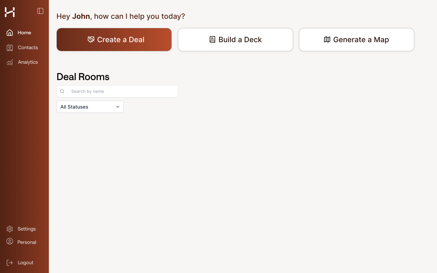
Creation Flow Revamp
Role: Head of Design
Duration: 1 month
Overview
The current creation flow experience feels segmented and confusing. There are spots where users are frustrated enough to drop off the creation flow.
How might we take the current creation flow and transform it into a intuitive and seamless experience?
What kind of experience do we want to give to our users?
Simple, Intuitive, yet reassuring creation workflow
Each step should feel easy and understandable
There should not be any handholding needed for users to figure out what they need to do during the entire creation flow


Discovery & Research
Personas:
(80%) Analysts - users want to be able to dive into each section and read the details, find the sources, add their own input
(20%) Brokers - users want to see high level points, review quickly and keep moving forward
Initial Discovery:
Reviewing LogRocket sessions of various user types and clients
Recording behavior and drop offs
Examining hotspots
User research calls on how users are going through the creation flow
Hearing their thoughts on each step of the process
Finding pain points and friction
Creation flow outline to validate ideal order of operations
Pain points from Users
There were required fields but no guardrails that let users know what needed to be completed
The narrative and executive summary pages were too vague and users did not know what to do or expect from these steps
Users wanted the ability to jump around the steps to input data they currently had and skip steps for data they didn’t have yet
Non-linear flow for users
Feels very segmented and does not flow together
Observational Takeaways
Users want to make the creation flow their own
Each company and account has their own way of inputting their data
There is an exhaustive amount of data input with nothing to give users a mental break
Our users have the same pattern for each type of deck they are creating
The UI is inconsistent and adds to the confusion on various steps
Takeaways and Notes
Product Approach
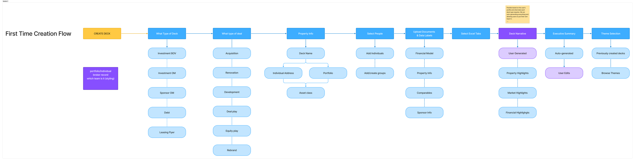
Breakdown the creation flow into sections. Find moments to input micro-interactions to breakup the flow. Find where we could input or remove items from the creation flow.
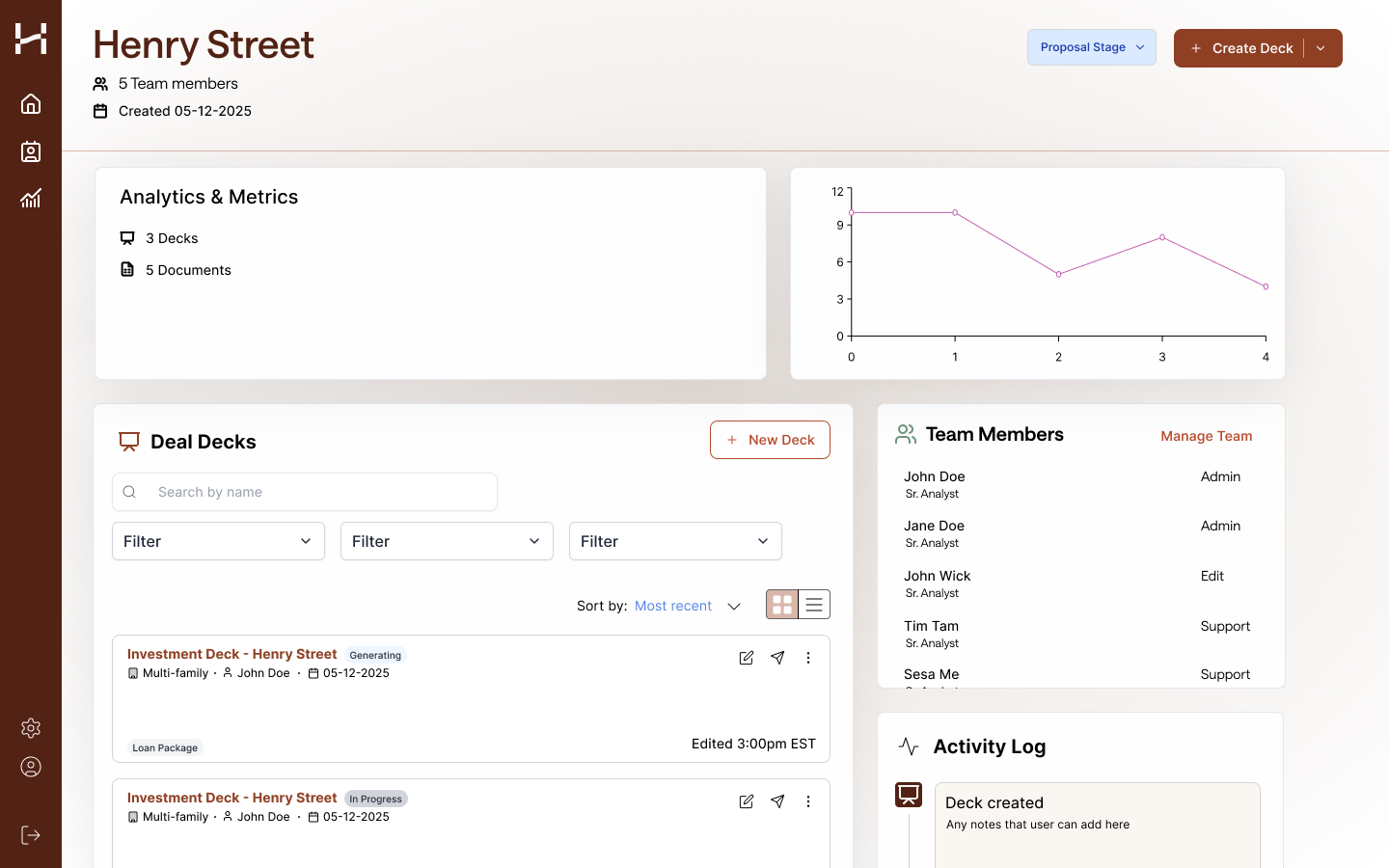
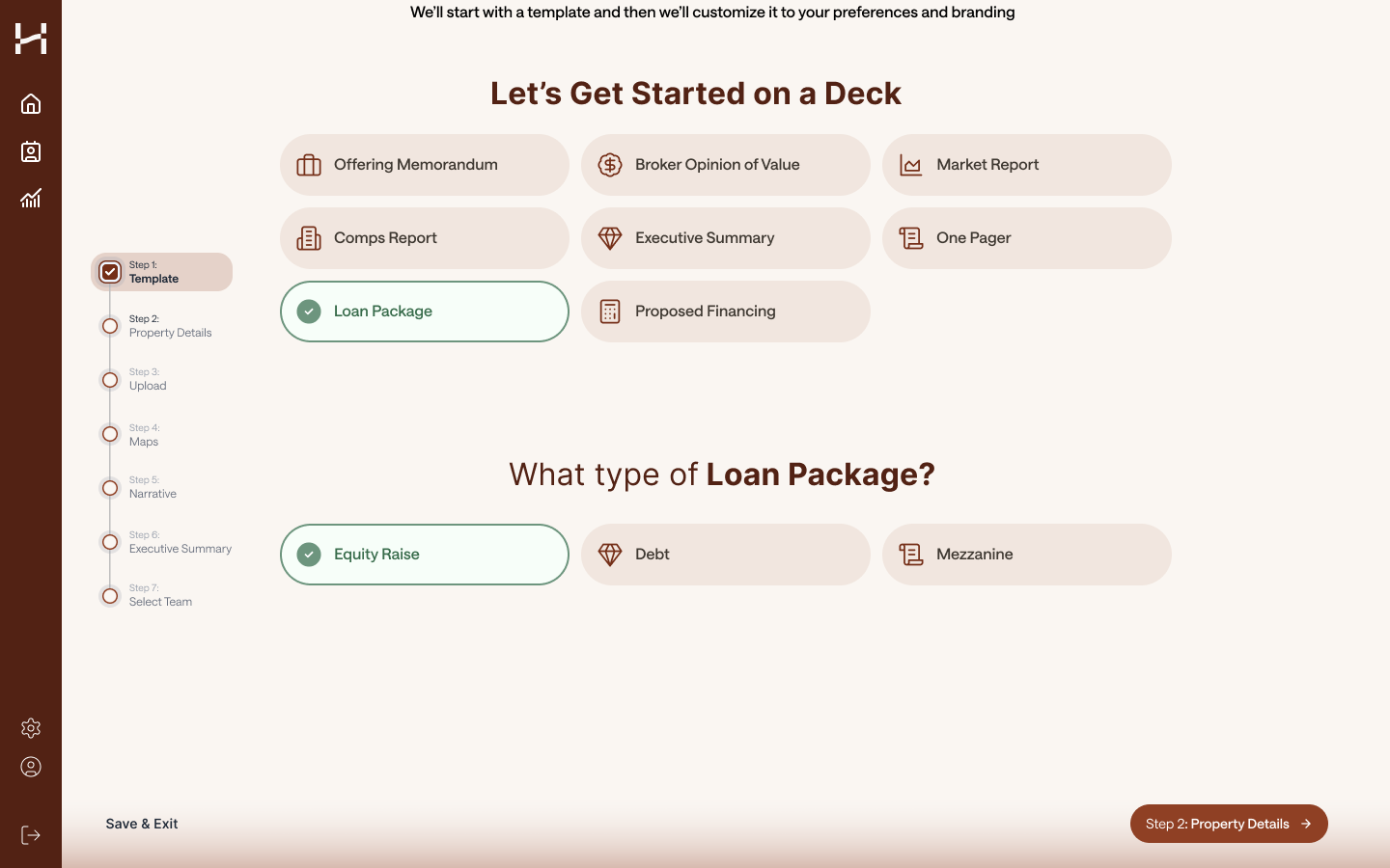
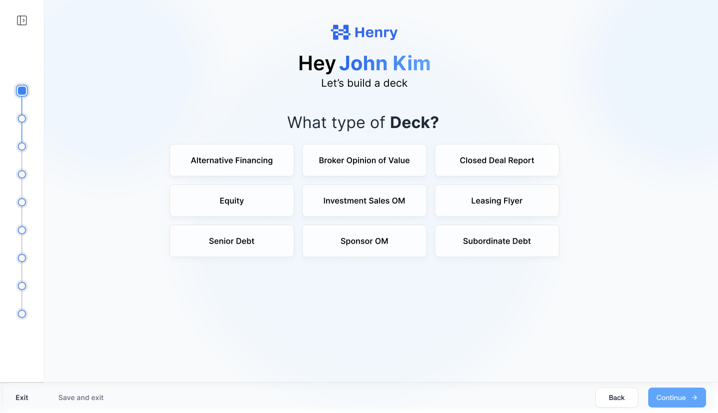
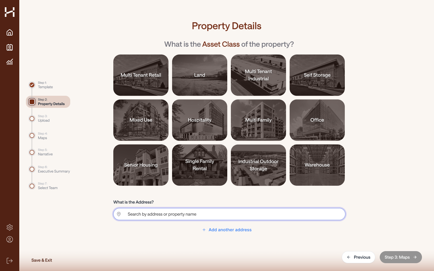
Part 1 - Deck Type + Property Details + People (Streamline)
Want users to be able to get through this part seamlessly and quickly (simple and straightforward)
It’d be great to auto-fill things in these areas if we can but it would faster for the user to select all the fields
A look into email integrations, slack integrations, etc
Selecting People to be on the deck
Users want a grouping mechanism and is more important that it seems
Main group → Deal leads
Part 2 - Upload files, images, links (Streamline)
Upload should be a single data dump
We are not trying to make the user customize their data right now, we want them to be able to put everything in one place at one time
We process everything at the same time, but prioritize documents and link because they require user input
Also skippable
Documents
Require user input
Labels → auto-filled before the user lands on the next screen
Select excel tabs
Require users to select which tabs to input and if any additional context is needed
*we could automate this under a certain number of tabs and pre-select all (Adam)
What is the limit, how do people review if they want to, what if users still want to leave comments for certain tabs?
Our users want to be able to review, even if its cursory as to whats selected and how they want their data manipulated, we just provide ways to speed up parts of this process
Images
Process in the background so that large files and big number of images don’t keep users stuck on the upload page
Links
Same general requirements as Documents
Can we make URL/Links easier to understand what they could do?
Sponsor links
Property links
connect dropbox/box/google drive
Auto-catch any conflicts or issues from the documents uploaded and prompt users to make certain decisions
i.e. no comps founds, or multiple financial documents found
Part 3 - Narrative & Executive Summary (Expand)
Narrative
Breakdown into property highlights and market findings
let users view each section to tailor the narrative based on what they’ve selected, added, or removed
This allows for users to be able to see the inner-working of our system and show our where we are pulling our data from
This would then lead into the executive summary for our users to understand that all of the items selected was made to create a personalized executive summary
Executive Summary
A full rollup of the sources and data points that were reviewed and selected in the narrative section
Auto-generate the executive summary for the user and then user can decide to do the following:
copy and paste their own executive summary
edit
ai-rewrite feature
Part 4 - Themes and Review (NEW)
Allow users to select the theme they had used previously for this deck type
idea: could let users select a particular deck that they want to re-use the theme and style of
or Browse themes that have been created for them
Long-term goal would be to create their own themes but this may be more efficient outside of the creation flow
This gives users a more visual engagement with their deck before they have to wait a couple hours to get it back
Additional Goal
Rebranding effort from the old blue to new brown branding
Research and Iterations (In-progress)


Moderated research sessions with the same users from initial discovery call
Takeaways:
Smoother experience and easier to visualize
Less thinking the user has to do with the new flow
“… this experience feels more intuitive, I understand what I’m getting out of this when I input my information.” (Marcus Millichap)
Feels more modern and more enjoyable to use. Users are enjoying the direction that the creation flow is heading

